Blog
3 Easy Steps to Design Packaging Tapes that impress
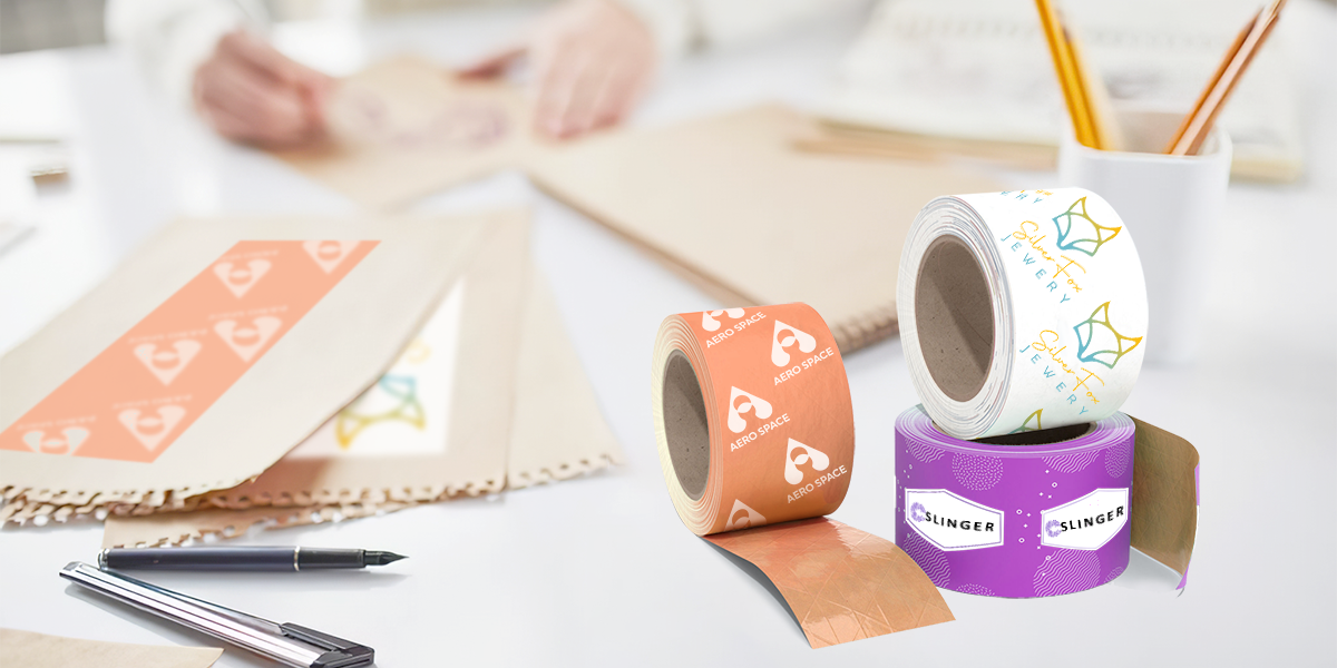
Many individuals find ads irritating, so they install internet ad blockers and skip TV commercials. However, advertising on packaging, on the other hand, is modest enough not to upset your clients. We believe that you want to design packaging tapes on your own to leave a great impression on their customers. In this blog post, we will suggest some ideas and guide you through 3 steps to make a packaging tape that win a place in customers’ hearts.
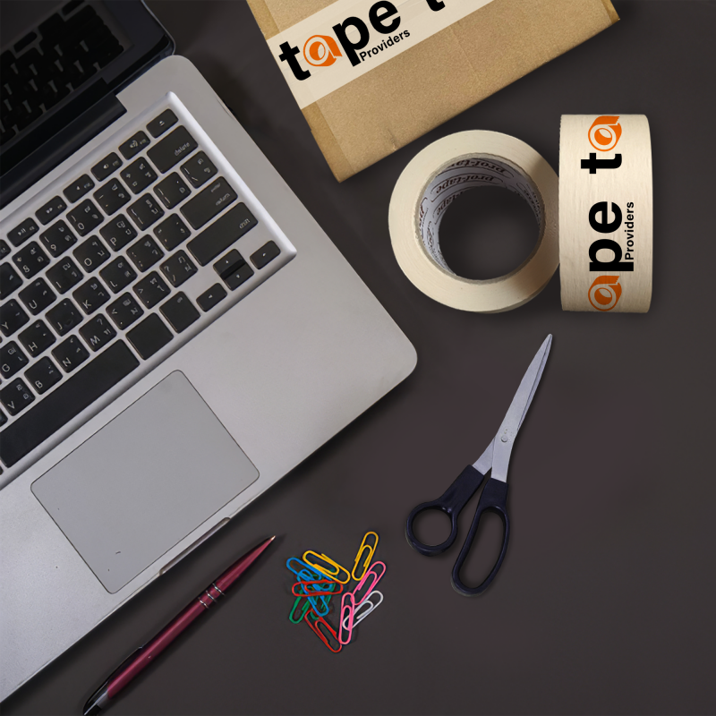
Step 1: Generate ideas
If you have no idea how to design packaging tape, check out some of our helpful ideas.
1. Decide what to put on your packaging tape
What is placed on the tape will clearly show your personality and uniqueness, so consider carefully when designing packaging tape.
Brand logo
Because humans have better visual memory, logos are an important thing that you should put on your tape. Customers tend to look at things from top to bottom and from left to right, so we recommend placing your logo in the top left corner to catch the customer’s attention.
Putting a logo will bring a huge benefit when having packaging tape with your logo. First, logo serve as a small billboard for your brand. Your logo is an important part of your branding efforts and placing it on a repeating ribbon is an easy way to get attention. Moreover, using packaging tape with a logo provides you with another measure of security against tampering. With standard duct tape, someone can easily cut out your box and re-glue it with a roll of tape they bought at the supermarket. With packaging tape with company logo, that is not the case. Your company is the sole source for that tape, so if someone tampered with the package, you would know.
Read more: Our top 3 sticker types for logo
Slogan or unique text
Besides logos, slogans are also something commonly seen when designing packaging tape. However, you must be very careful when adding slogans or text in design packaging tape.
- Make sure your slogan is short, concise. Your text should be unique and describe the special value that your brand wants to bring
- You should balance the size of the slogan and logo to have a balanced and eye-catching brand packing tape
- You’ll want to make sure you’re using the right font pairs so as not to complicate the look and feel of the logo. And remember to choose simple fonts, not handwritten fonts
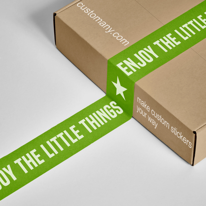
Images
You can select several suitable images when designing packaging tape to visualize your products. However, pay attention that you let your colored packaging tape have space, do not insert too much text and images because it will distract customers’ attention on your brand.
2. Build brand personality by design packaging tape
Design packaging tape is also an effective way to promote your brand, so design packaging tape must clearly show your brand personality through layout, colors, images,… Here are some ideas to express it. Your brand personality is very effective that you can refer to.
Bright and bold
A vibrant bespoke packaging tape design stands out. It has a mix of colors and images that attracts attention to your box, bringing your brand and message front and center. To make custom packaging tape colorful and bold, consider these elements: a packaging tape with bright color, up to three different ink colors to match logo, multiple design components, including such your logo, a contact, and contact details, readable, bold type. Don’t overdo it with color in a dramatic box design. A logo with too many colors might be difficult and expensive to produce. Use a complimentary color palette to get this appearance.
Charmingly classic
Custom packaging tape has a classic look. This aesthetic uses classic components like colored or neutral tape, one or two ink colors, and a simpler design than the colorful and dramatic look. Consider these aspects for bespoke packaging tape to obtain a classic look: Neutral and colored tape, complementary ink colors, design with your logo and phone number, website, or social networking handles. Avoid these branding blunders for a timeless packaging tape design. Too many colors, the inappropriate color combination, fancy typefaces, and words should be avoided.
Modern minimalism
Minimalist style is popular in fashion, home design, and bespoke packaging tape. Minimalist design uses few design components, a restricted color palette, and simple shapes and typography. Consider the following aspects for contemporary packing tape: transparent or moderate tape colors like tan, white, or black; one ink color that contrasts well with neutral tape, such black or white, simple logo or design. We have advice that low packaging tape design doesn’t imply minimal effect. Use custom branded packaging tape to showcase your minimalist design. This design looks great for promo codes and other branding aspects.
3. Select the right type of materials
When it comes to packaging materials, there are numerous types you can choose from. Usually a packaging tape is made up of 2 layers, the backing layer and the adhesive layer. Some types of tape have a reinforcement backing layer of fibeglass for extra durability. So when choosing materials for an adhesive tape, you must learn about these types of layers to know which is the best choice. Read our article about types of packaging tapes to make the best choice.
Step 2: Design packaging tapes
Designing packaging tape is quite easy and can be practiced in only 3 steps.
1. Pick your size
Select your tape size or pattern length of design packaging tape to repeat on tape is the first step. Custom packaging tape will be printed in a seamless three by 12 inch pattern. This means that your pattern design should be either 3 by 12 inches or three by any factor of 12. And then create a rectangle the size of your artboard using the Rectangle tool (M) and remove the stroke and fill it with your preferred background color. Finally place the rectangle in the middle of your image and secure it in place.
2. Choose the styles of pattern
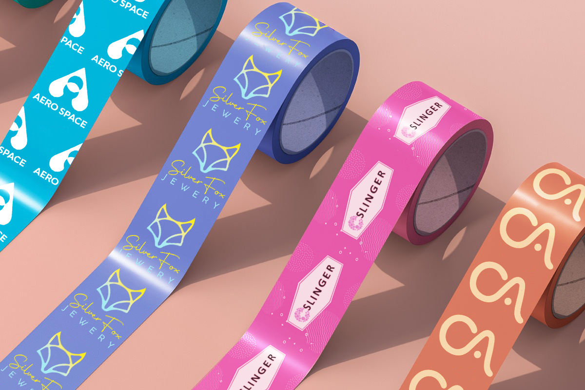
There are many different styles of pattern like landscape/portrait/step & repeat/seamless artwork but portrait and landscape are the most popular styles. There are some differences between the portrait or landscape design.
| Parameters of Comparison | Landscape | Portrait |
| Meaning | The landscape is the image or page orientation which has longer width and shorter height. | The portrait is the image or page orientation which has taller height and shorter width |
| Orientation Pattern | The landscape is horizontal in orientation. | The portrait is oriented vertically. |
| First look | The landscape orientation is more expensive. | The portrait orientation is limited. |
So up on your products and your brand personality, choose the suitable styles of pattern for design packaging tape.
3. Decide your colors
The design process begins with choosing a color for the tape backdrop. To increase design visibility, choose neutral backdrop colors like white, particularly if your artwork incorporates text. If you like, you may choose vivid, eye-catching hues. Depending on your brand personality, choose a background color of design packaging tape that matches the personality you want to convey.
The next part is to choose the text color and image color. Pay attention to choose a font color that stands out on the background you have chosen, the color of the text is usually the opposite color of the background color. Besides, choose images with the same color or the same color as the background or text color to create a connection in your packaging tape with the logo company.
Step 3: Review your artwork
Before choosing design packaging tape as the official shipping tape for your product, reviewing the colored packaging tape is an important step.
Impression
You must be sure that your design packaging tape will leave an impression on the recipient of your product. To do that, the styles of patterns must be reasonable, clearly showing the brand personality, the layout of the objects on packaging tape with company logo must be reasonable, and the ideas must be unique.
Professionalism
Your design packaging tape must be professional. Design packaging tape should not be a combination of colors that are too prominent and have great contrast. Logo also should not contain too many cute images, easily diluting the message of the product and the brand.
Subtlety
You have to check that your packaging tape with your logo is subtle enough to be an ad type. This depends on whether your design evoke special value that your brand wants to bring.


