Blog
Choose your perfect label colors: 3 things you should know

What color right away comes to your mind when designing your product label? Is it a attractive color? Attention-grabbing is a good idea, but using unsuitable label colors or overbearing combinations could turn customers away. If you are in the process of making your own label, learn how to choose colors that not only grab your customers’ attentions but also keep their interest in the long run.
To do that, we offer 3 tips that help you understand which emotions each color is said to convey, what affects your label colors decision and how to arrange the perfect color combination.
1. Assumptions About Color

Have you heard about color psychology which stated that specific colors can be convey to specific states of human emotional arousal? Bright colors are usually linked to associated with impassioned expression while dark colors are associated with the feelings of calm and tranquility. In business, colors used on product label have the ability to create different emotions for customers and thus, affect their behavior. There are 10 common colors to include in a product label and the emotions they convey.
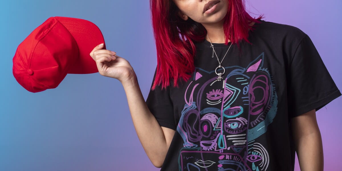
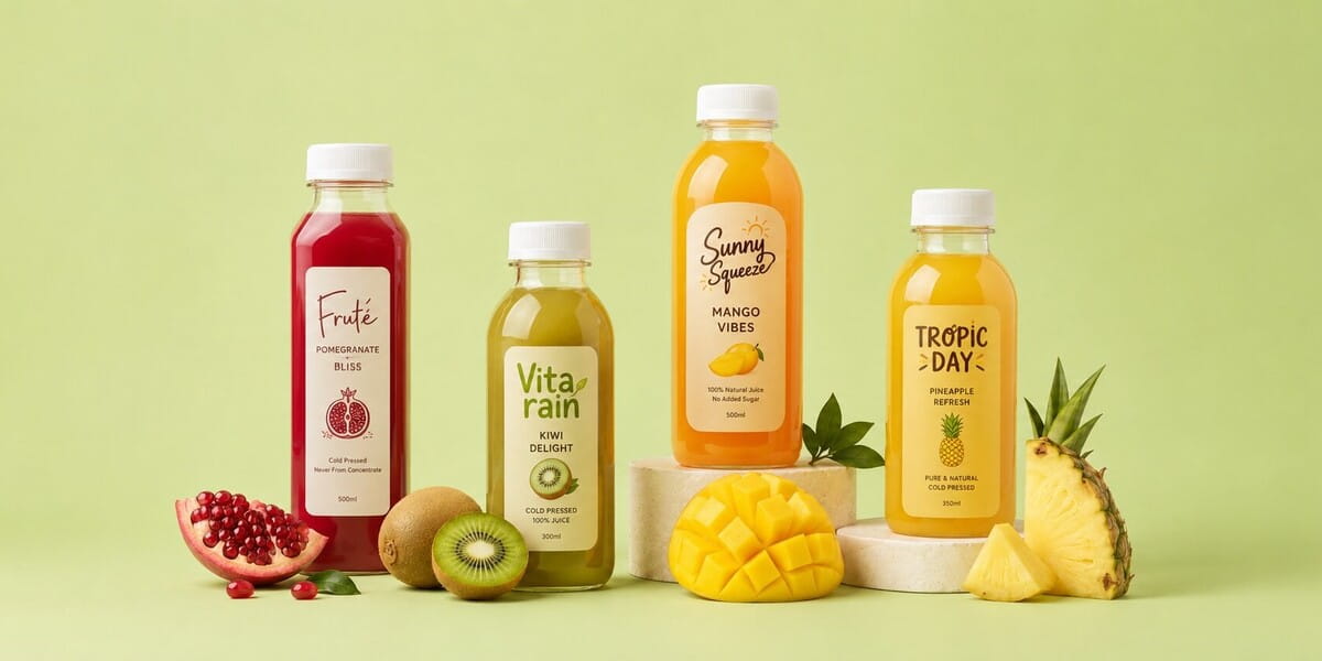
Red
Red exudes bold and passion. It is associated with confidence, strength and power. In labeling, red is used for its ability of quickly grabbing people’s attention. Red increases our metabolism, thereby stimulating our appetite. This is why numbers of fast food brands having labels or logo in red. However, sometimes red means warning and dangerous, so you need to coulpe it with right color to convey the right message you want. For example, red paired with pink shows romance, while red paired with black shows mystery or performance.
Orange
Using this color means you want to be prominent and show self-confidence. It also evoke vitality, hunger or adventure. This is why orange is used on product label to create excitement and entice consumers to buy. Orange also exudes fun so it grab children’s attention and should be used on children toys or snacks label.
Yellow
Yellow is the most visible color in the color spectrum. It represents joy, optimism, high energy, and happiness. You also can use yellow to stimulate creativity. However, pay attention to chroma when using yellow because in some cases, bright yellow can communicates irritability or danger.
Pink
This is usually considered a girl-intended color. When you think of pink, you think about sweet, feminine and romantic, so this color is popular on the labels of products for girls. Pink also says about loving and nurturing which is best used for babies products. It is believed that pastries taste better in pink plate and boxes so bakery should consider it for their labeling and packaging. However, pink also triggers the feeling of fatigue so pairing it with other colors may help.
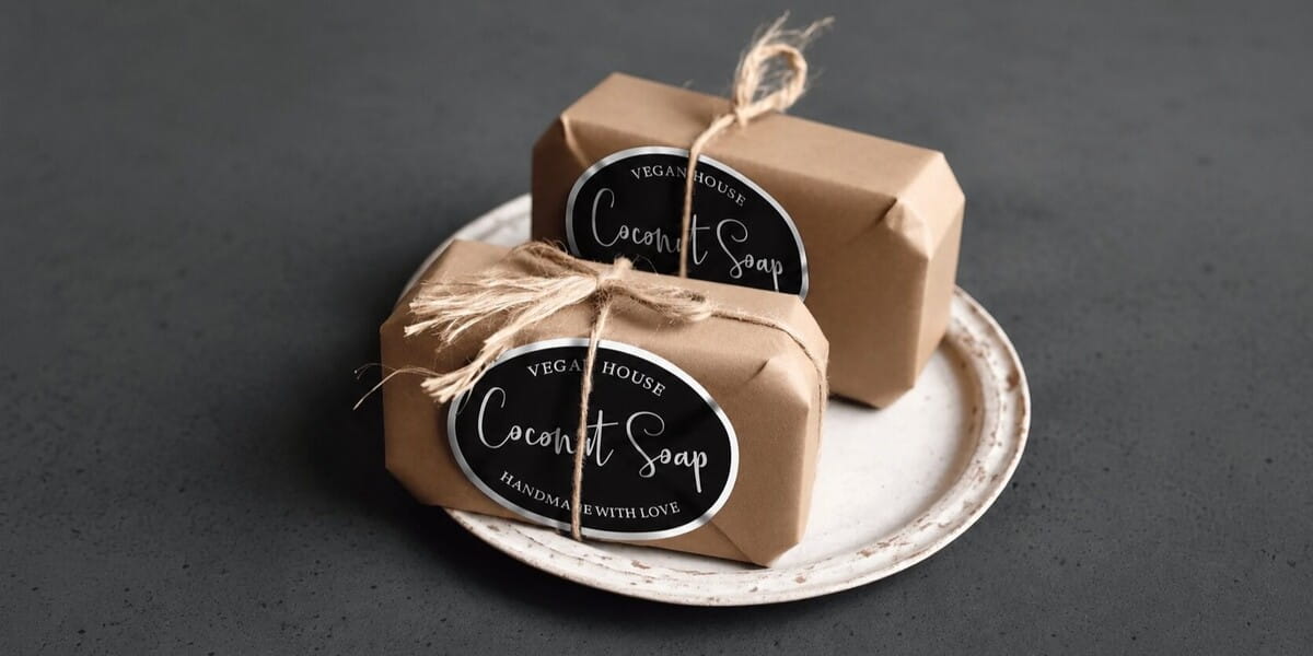
Brown
Brown evoke the feelings of comfort and reliability. It is the most used for background color when it comes to labeling, packaging or advertising. Though, like other dark colors, brown sometimes evokes negative emostions such as is lonliness, sadness or depression. If brown is used over a large area, it can create the feeling of empty and isolation.
Purple
Success and imagination is what people think of purple. This magical color tends to make people’s mind wander. It stands for wisdom, ambition, and luxury. However purple also represent appear exotic or artificial so you may want to prevent using it on fresh food labels.
Green
Green symbolizes freshment, nature and health. In labeling, green indicates a concern for the environments or a connection with sustainable values. When green being paired with blue and brown, people will think of Earth and the environment. It also exudes happiness and relaxation, which in fact has the potential to reduce our blood pressure. You can also use green to signify growth or success.
Blue
Blue is known as the most common color used in labelling. It shows confident, loyalty and security. Blue is thought of calmness and serenity. The most common color used in branding, blue is thought of as loyal, secure and honest. Blue is widely use in labeling of drinks, health goods, or even auto industry.
Black
Black is symbol of mystery and elegance. It is also the color that is used on luxury goods such as watch, jewelry and perfume for its ability of suggesting a sense of stability and power. Other shades, such as grey or silver, is used by high tech companies because they evoke sophistication and authority. In labeling, black is predominately used to bring out other colors or creat contrast.
White
White is a color of simplicity, purity and cleanliness which makes consumers feel secure. In labeling, white typically serve as a underpriting layer or a background to provide contrast just like the black color, or to prevent overcrowding when there are too many details on your design.
2. Elementors that affect your label colors
It is significant to note that there some colors are visually appealing while other colors are not this much powerful. However, color theory is a lot more complex than that. In fact, no color is absolutely effective or should be avoided. As we can see, all the colors mentioned above can convey positive and negative emotions based on where we used them and which color we pair them with.

There are 4 elementors surely affect your choice of label colors:
Brand colors
Label colors have theirs full emotive power in a clear and defined brand context. When choosing colors for your label design, you need to make sure the chosen ones speaks to the traits of your brand. You may want to consider similar or related colors to the colors that are used in your brand logo.
Combination of colors on all label’s parts
3 parts on a product label include label font & typography, image and background. Choosing label colors means choose colors for all these section. Make sure you choose the suitable and efficient colors so that information is clearly display, images are not blurred and all complement convey the intended message of your brand.
Product and container’s colors
Whether your label will be placed on a container or directly wrap your product, these colors will be the background for your label. You can choose a complementary color to ensure harmony, or go bold with contrasting colors to help accentuate the label.
Culture in the local market
Label colors strategy can brings you big success or sometimes costly failure depending on specific local culture in which the product will be consumed. Understanding the concept of color in the target market will help you avoid such unfortunate mistakes.
3. How to arrange the perfect color combination
Apply 2 tips above we guess you’ve got a few label colors in mind. You need to find the answer for the last questions: which is their perfect chroma and what is the best way to organize them? A color palette or a color scheme will be helpful for this. Some useful and easy to use tool you can try are Coolors, Color Hunt, Adobe Color for quicky checking on color trends, colors shades or generating a color palette that works.

Conclusion
Label colors is the key to form customers emotion about your product. Be sure to focus on your product strengths and your brand value. We hope we’ve given you all the tips to choose the right colors for your label design. Now, you might want to access CustomAny site for make your label become true.