Blog
Custom Food Sticker Labels: 3 Design Hacks that Increase Brand Awareness
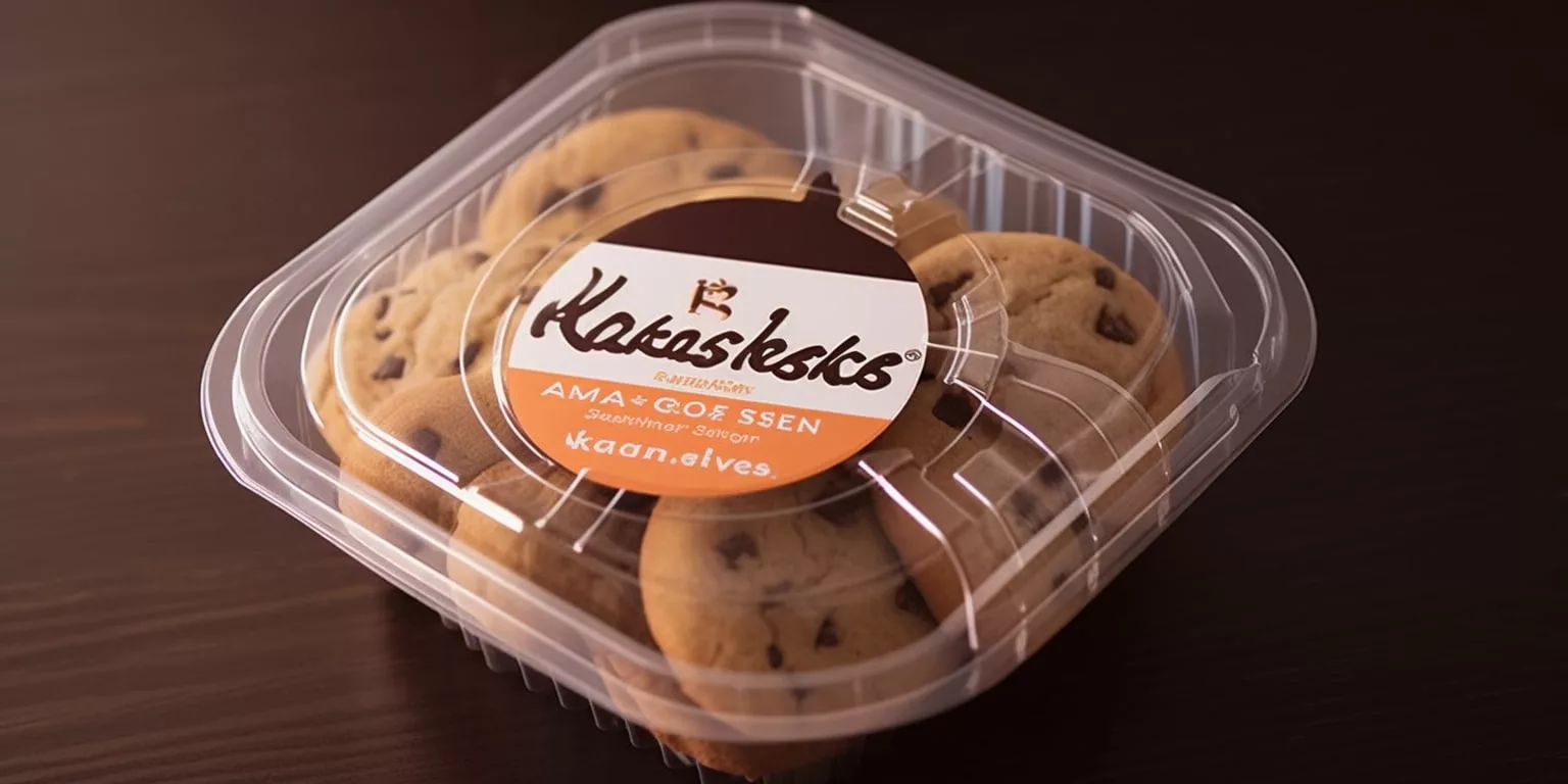
In the highly competitive food industry, building a strong brand identity and recognition is crucial for success. One effective way for both large and small business food packaging to achieve this is through custom food labels. They not only convey important information but also capture the essence of your brand.
In this article, we will explore 3 design hacks that can take your food sticker labels to the next level, helping you enhance your brand identity and boost recognition among your target audience.
Let’s dive in and discover how to make your custom food labels a powerful tool for brand promotion.
3 Design Hacks that Enhance Brand Identity and Recognition
There is no denying the importance of design in a successful food sticker label. In addition to the information that must be included, such as the product name, the brand name, the ingredients, and the information on food hygiene, the design of the custom food label must have something unique, like designs that reflect the brand personality or storytelling.
The following are three design hacks that may help achieve this goal:
1. Unconventional Label Shapes and Finishes
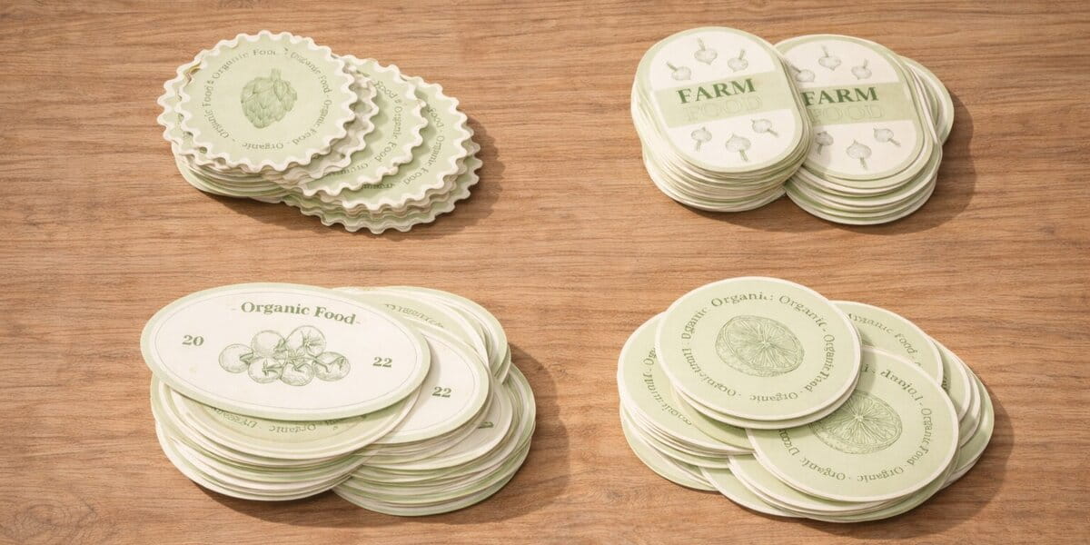
Unconventional label shapes and finishes allow you to stand out from your competitors. In a crowded marketplace, unique shapes and finishes can capture attention and make your product instantly recognizable. This helps to differentiate your brand and increase shelf appeal.
Because of this, die-cut labels are highly recommended when you need a unique design for a food sticker label. You can label in the form of the product’s main flavoring ingredient, such as a tomato for tomato sauce or a banana for banana-flavored things.
Or, if you want to suggest a whole meal or dish ready to be served, you may use a label shape that looks like a plate or platter. Prepared foods, frozen dinners, and catering services may all benefit from these die-cut shapes.
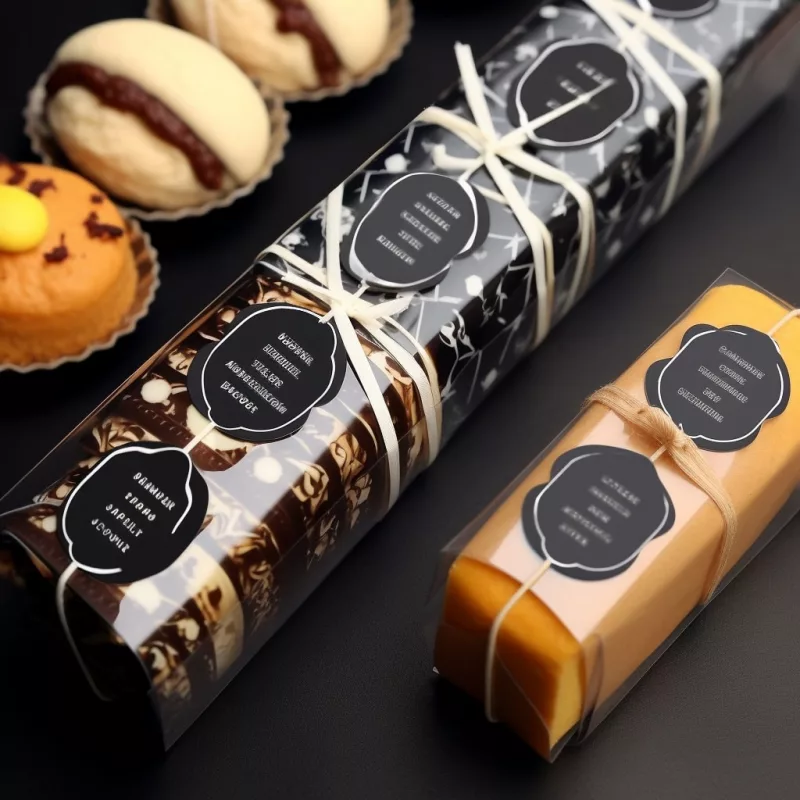
Besides, designing food labels with unique finishes like matte, glossy, holographic, glitter, or embossed is also a great idea.
Let’s take a look at the two cases below to see how finishes enhance custom food labels:
- For Artisanal Pasta, a label with a matte texture works well. The label’s matte surface emphasizes the pasta’s quality and uniqueness, which complements the pasta’s natural, handmade aesthetic.
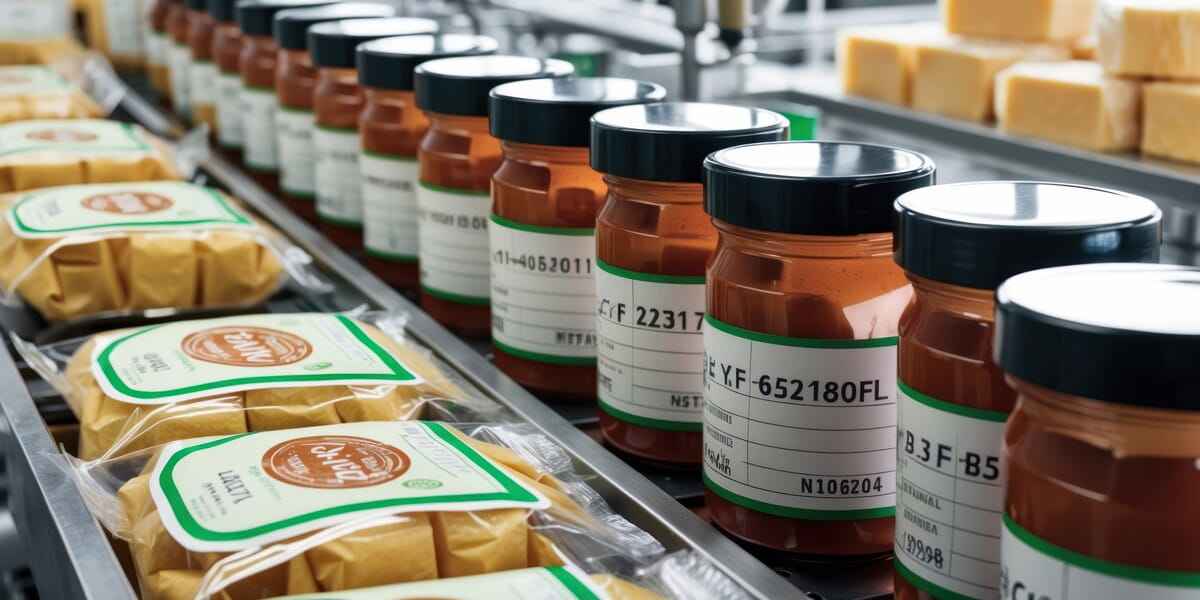
- On the other hand, bottled gourmet sauces benefit significantly from having labels with a glossy appearance. A gourmet sauce would have a more expert and refined appearance if it had a label with a glossy finish. This would help the sauces to stand out on the shelves and give the impression that they are of superior quality.
2. Captivating Visuals and Imagery
Brand awareness may be improved via the use of eye-catching images on customized food sticker labels. In order to create an impression with your food sticker labels, consider these suggestions:
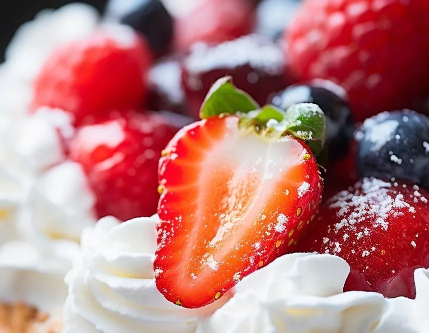
Mouthwatering Food Photography
Food photography has the power to activate the senses, especially the sense of taste and smell. By showcasing appetizing and visually appealing images of your food products on your sticker labels, you can raise the desire to taste them.
Besides, artistic·and enticing food photography conveys authenticity and builds trust in your brand. When customers see mouthwatering visuals of your products, they are more likely to perceive them as high-quality and trustworthy. As a result, consumers are more likely to be loyal to the brand and it can gain a positive reputation.
Farm-to-Table Images
By incorporating images that showcase the journey of your products from the farm to the table, you can effectively communicate your brand values, connect with consumers, and differentiate yourself in the market.
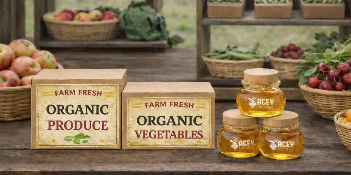
Farm-to-table imagery creates a connection with nature and the origins of food. When showcasing images of fresh produce, bountiful harvests, or farm animals, you can tap into consumers’ desire for wholesome and natural food experiences.
The farm-to-table concept not only adds visual appeal to your food product label but also communicates a deeper story that resonates with consumers seeking sustainable, ethical, and locally sourced food products.
Ingredient Close-ups
Food label ingredients, like an organic food label, allow you to highlight the quality and freshness of your ingredients.
For instance, you can highlight the vibrant colors and textures of fresh fruits and vegetables included in the food product. This can include close-ups of ingredients like juicy strawberries, crisp broccoli florets, or colorful bell peppers.
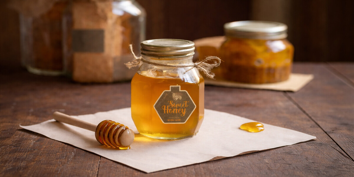
Similarly, close-ups of natural sweeteners like honey, maple syrup, or agave nectar can provide a visually appealing representation of the product’s natural ingredients.
By capturing the vibrant colors, textures, and details of your ingredients on your sticker labels, you visually communicate to consumers that your products are made with the finest ingredients.
3. Typography that Stands Out
As part of branding, typography is an essential element that can convey the personality of your brand and the message you want to communicate.
The importance of selecting fonts
When it comes to impressive typography, selecting the right fonts for your brand and ensuring legibility across various sizes and platforms are crucial.
Different fonts evoke different emotions and perceptions. For example, a bold and modern sans-serif font communicates a contemporary and forward-thinking brand, while a classic serif font conveys elegance and tradition.
Fonts help establish the tone and voice of your brand’s messaging.
We mentioned this in our article: “45+ great label font suggestions to match your brand’s personality“. In that article, we listed 5 main brand personalities and suggested suitable fonts for different requirements. So, we highly recommend you to consult if you want to learn more about this issue.
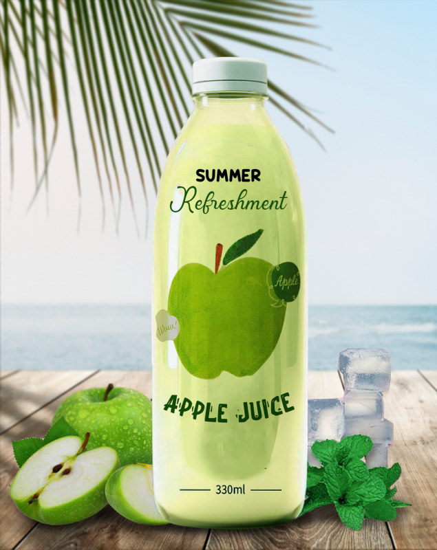
Additionally, legibility is crucial, especially when displaying your brand’s messaging on different platforms and sizes. Here are some useful tips you should consider:
- Using easy-to-read fonts to ensure your audience is able to understand your message.
- Fonts with balanced letterforms, clear spacing, and simple shapes tend to be more legible.
- Test your chosen fonts across different sizes and devices to ensure legibility across all mediums.
Examples of custom food labels with striking typography
To demonstrate how typography can effectively stand out when making a food label, here are a few food label examples:
- For a gourmet bakery specializing in artisanal pastries, a food sticker label could use a handwritten script font to evoke a sense of craftsmanship and personalization. The flowing, elegant strokes of the script font can create a whimsical and inviting look.
- For a children’s snack brand, playful, rounded typography with vibrant colors is ideal. This typography would effectively catch the eye of young consumers and their parents.
Tips for choosing and using typography effectively
To help you utilize typography optimally in personalized label stickers, here are some additional tips:
- Contrast for impact:
Create visual interest and hierarchy by using contrasting font styles, weights, or sizes.
For example, pairing a bold, attention-grabbing font for the product name with a simpler font for supporting information can make the label design more dynamic.
- Balance information density:
Labels often have limited space, so carefully consider the amount of text and information you need to include. Choose fonts that allow for easy reading without overcrowding the design. Condensed or narrow fonts can be helpful for fitting more text into limited space.
- Align typography with visuals:
Ensure that the typography complements the visual elements of the label design.
Consider the overall aesthetic and theme of the product and select typography that matches the style, whether it’s sleek and modern, rustic and organic, or vintage and retro.
- Consider custom typography:
If you have the resources, consider creating custom typography that is unique to your brand. Custom fonts can give your labels a distinct and memorable look.
Word to the Wise
By using the design tricks mentioned above to make labels that catch customers’ eyes, you finally engage with customers on a deeper level, then enhance the brand awareness.
If you have any questions about printing or the design of product labels, feel free to contact us by [email protected] or any of our social media sites (Facebook, Instagram or Pinterest). Also, you can check out the related blogs we’ve posted or subscribe to our service to get our most recent business tips as they become available.


