Blog
Top 10 awesome coffee packaging designs – Updated
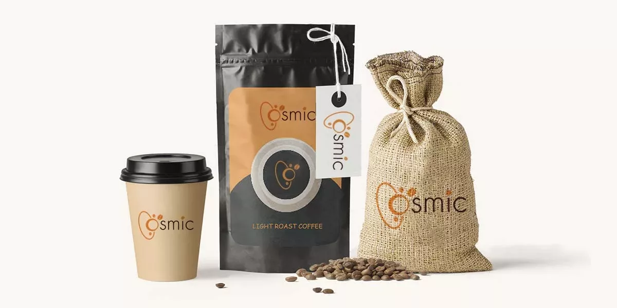
What style is the packaging design of your packaged coffee products? Do you own a well-known coffee brand that has circulated a branded packaging for years, or have your products just recently launched and its outlook is still in the process of optimizing? No matter what situation you are in, staying up to date with trends and implementing exciting changes to your coffee packaging promise to deliver not only a great experience for your customers but also a great growth for your business. With that in mind, let’s discover top 10 awesome trends for coffee packaging designs this year!
1. Story-telling: Localized Illustration
Brand story-telling on the coffee bag is no longer a new wave in coffee packaging designs; however, this year you can try to combine this with localized illustration.
This is a chance to engage with your audience and communicate your story by illustrating a fascinating aspect of your coffee production. For example, you can create your iconic packaging based on:
- Who and how are the coffee farmers you work with
- Where you have discovered the ideal coffee beans
- Your efforts to source your coffee sustainably
A storyline describing the product formation connecting with any artwork is an awesome illustration as it aids in efficiently expressing the design’s visual concept. Most consumers place their attention on goods that directly link the caliber of the custom packaging and labels to the product’s class. So this allows your coffee bag to become unique and outstanding in the market.
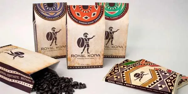
2. The feels: Tactile texture
Brands are learning the benefits of tactile textures as they search for methods to make their coffee packaging designs stand out. Techniques that give package texture are becoming more popular, including:
- Foil printing: using reflective metallic materials on packaging
- Die-cutting: packaging with artistic cuts
- Embossing and debossing: the coffee packaging is raised or depressed in some places
The employment of these printing techniques on coffee label designs and packaging designs always increases the perceived worth of the product because they look extremely upscale and are frequently connected to high-end businesses.
As more and more packages are designed with digital elements, this coffee packaging design trend gives us a brand new experience of tactile feeling. This is a merit to use unique textures on trendy packaging because they engage more senses than just the sight.
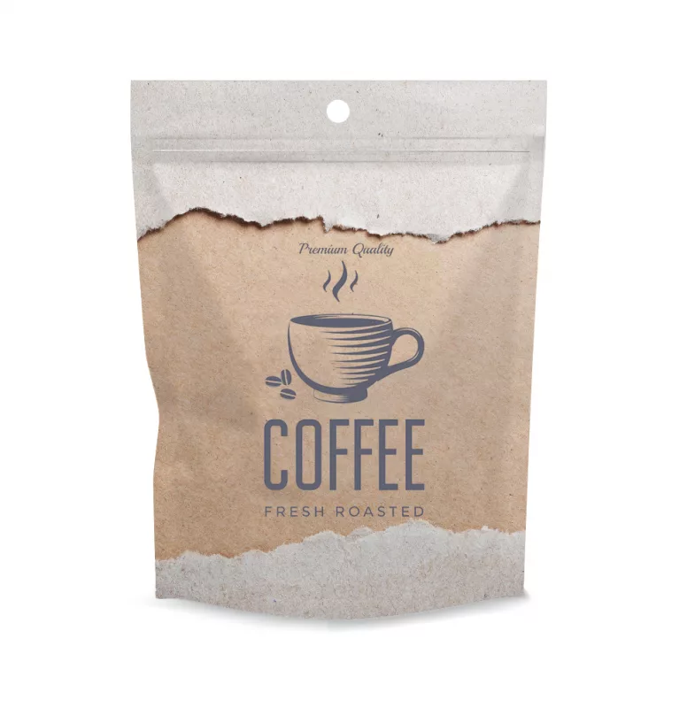
3. Retro Styling: ’70s vintage
Retro Styling With Throwback Appeal never cools down in coffee packaging designs.
It seems sense that the cozy color palettes and soothing, wavelike images of the 1970s are making a resurgence in home decor, fashion, and even coffee package design trends. This fashion for design embodies familiarity and uniqueness. Generally, the ’70s vintage aesthetic packing is characterized by:
- Earthy color schemes, especially those in brown and orange tones
- Bubbly serif typefaces
- Thick, squiggly patterns.
By drawing inspiration from their previous packaging designs, coffee brands with lengthy histories might benefit most from a vintage design with retro flair. However, brands that want to represent a certain era like the 70s must use objectivity with care when designing packaging as customers might object to your design decision.
4. Earthy Look: Neutral Color Shades
The focus of coffee packaging designs for the following year is said to be more on traditional or natural features. In fact, many coffee companies are advancing the eco-trend in product design, so in addition to avoiding plastics that are harmful to the environment, they employ natural hues in their packaging.
The featured tones that go well with an earthly look design are the neutral. Neutral color shades are frequently used in the packaging of organic food and have become popular in the specialized organic coffee industry. To highlight your brand’s commitment to the environment and the sustainable product packaging you use, use colors like low-saturated browns, blues, and greens.
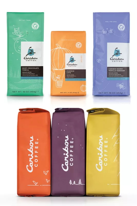
5. Aesthetic approach: Abstract designs
This year is the time for abstract design to thrive. It is an aesthetic approach to the coffee packaging designs by utilizing the energetic art of the Aboriginal people. Designers can employ the highest level of abstract trends on packaging by using:
- Bold letters
- Dazzling colors
- Severe emphasis on minimalism
Abstract art encourages our brain to think in a less constrained and exhausted way, revitalizes the area of the brain that controls curiosity, thus creating a fresh approach to the product and stimulating purchasing decisions.
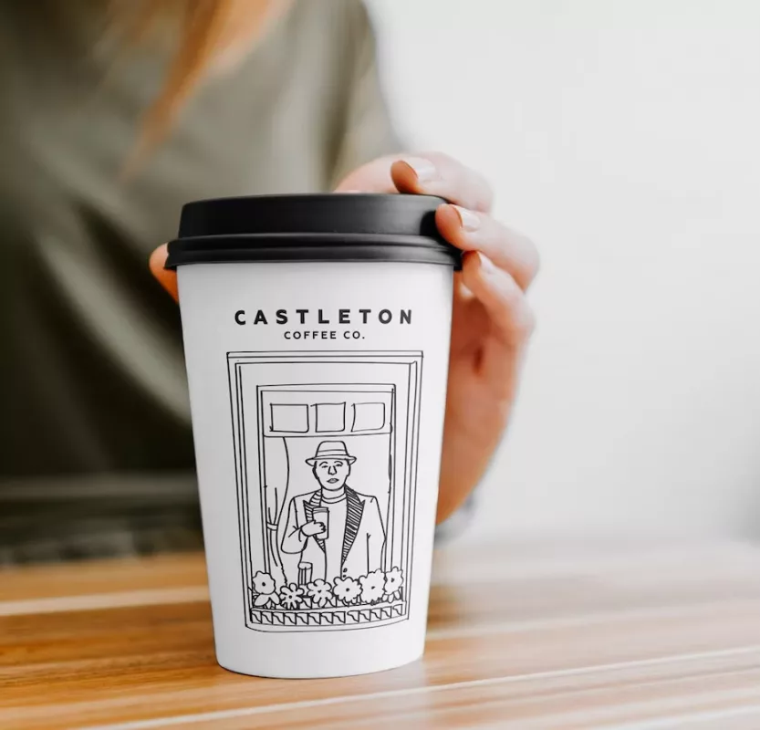
6. Bring in the Art: Cartoon charm
Cartoons have always had a unique charm. Unlike flawless cartoons in film and television, cartoons on coffee packaging designs in 2023 tend to be minimalist aesthetic, much like newspaper comics. They have the appearance of having been hastily and fluidly hand-drawn. Having such illustrations on packaging can help a brand’s personality by highlighting its appeal and bringing it to the forefront.
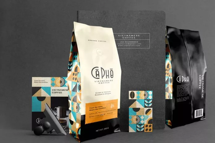
7. Simplism: Geometry with colors
The next level format for a unique coffee packaging design will be one with exact angles and few lines: geometric elements. It will be the key packaging design trends for the upcoming year for its simplicity yet elegance. With this trend, consumers will primarily gain an insight into a product’s values. The packaging patterns and graphics that depict what is inside the packaging stand out sharply in contrast. In addition to being straightforward, these designs are an effective way for businesses to establish their presence and leave a lasting impression.
8. Cool typography: Loud, Modern & Bold fonts
In this fast pace of life, people seek to complete their shopping more swiftly or efficiently. Imagine what can happen if your coffee packaging design is excellent but the fonts in your product label are subpar? If you select typefaces that are hard to visualize and require more effort to recognize while choosing them, your coffee bag may languish on the shelf for longer.
Bold, modern typefaces will be used more in design trends going forward than traditional typographies. Loud and current typefaces make it simple for competitors to notice the product title. Especially, combining them with contemporary color schemes and other design elements, customers will quickly recognize your coffee.
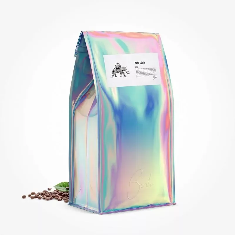
9. Effects: Holographic and Gradients
The holographic and gradient are trending effects not just in sticker field but in coffee packaging design. These effects absolutely can make your coffee packaging stand out from the crowd. These two look fantastic in digital formats, even when it is a plain form or being combined with other illustrations. For coffee bag design ideas, using holographic and gradient by including vibrant and energizing color schemes to awaken your customers’ eyesight.
10. Way more interactive: QR codes
Technology is improving packaging. Future coffee packaging design trends will include modern technologies such as QR Code. This significantly improves brand perception and at the same time bolsters trust.
With smart packaging that comes with a QR code, customers can directly interact with your brand. You can use QR codes to direct customers to your website, to your brand story, to a sale promotion or to some ready-made recipes. This smart and interactive packaging trend brings customers an immersive experience where they can easily stay connected to their coffee suppliers in a digital environment.
Conclusion
The time brings changes in packaging trends, especially in coffee packaging designs. This year, it’s said to be all about sustainability, earth tones, simplicity, maximalism, and vintage styling if you want your coffee bag art to remain current. Make sure you understand what appeals to your target audience because certain 2023 packaging design trends seem to conflict. Discover what your clients prefer, and then let the newest trends guide the remainder of your choices.


